In the autumn of 2006 the Interactive
Institute in Stockholm, Sweden, asked me to curate a workshop
and an exhibition. The form of the project was very open, in fact
I had very much a carte blanch with just a few simple instructions.
The idea was to get some artists and engineers together and try
out some new ideas. There were some interesting parameters to
play with: the number of artists (number), the length of the workshops
(time) and the theme chosen (theme). I will below discuss the
different parameters, what they meant for the Man Machine project
and how this model can be varied. I will also discuss how artists
and engineers can work together and what different methods here
will give. I will then turn over to the actual productions of
the project and discuss the installations regarding their concepts
and technological solutions and compare them to other similar
pieces and other pieces made by the same artists.
The model:
the EAT concept
The model for the project was simple.
We wanted to let engineers and artists meet in a workshop and
let them start working out some ideas together. This is of course
something that has been done a number of times before and when
we were planning the project we often discussed the way EAT and
Billy Klüver worked. The history behind Billy Klüver
and EAT is quiet well known, our time has just rediscovered the
importance of their efforts, so I won’t give the full history
of it here, just a brief background. It started when the engineer
Klüver was asked by his friend Jean Tingueley if he could
help him with a project he was planning for MOMA in NYC. The project
became the famous happening Hommage a New York, a large sculpture
made of different found material, especially old bicycles. During
one evening outside MOMA the sculpture destroyed itself in clouds
of smoke. After the event other artists asked Klüver for
help, such as Robert Rauschemberg. Klüver started to get
help from other engineers at Bell where he was employed. After
a number of projects an artist and engineer pool was opened, which
connected artists and engineers: artists and engineers could simply
come in with ideas to EAT and they would match people and projects
together.
I have always dreamt of starting
this type of a pool since I heard about EAT for the first time
about 10 years ago. The idea seemed so simple and brilliant and
in the Man Machine project I had a chance to really try out the
model for the first time. In this model there was one big difference.
We didn’t expect the invited artists and engineers to bring
ideas to the workshop. Instead we wanted the ideas to come up
during the collaboration. This fact also meant that the frames
of the curation and the parameters of the project became more
important.
The process will be analyzed and
given in detail below but let me just shortly describe what happened.
First we had an introduction of the theme, a small lecture of
the history of man and machine. Then a couple of hours of an association
workshop where different images were discussed. During the discussion
a number of ideas for projects came up and those were then discussed
and evaluated until each artist had an idea to start to plan together
with the engineers. We then had five days of production when all
technological problems were solved and computers were programmed
etc and on the fifth day five different pieces were pretty much
finished to be shown.
One or two of the ideas were brought
to the workshops by the artists but the other ones came up during
the workshop. In one case the idea was a total collaboration between
the artist and one of the engineers. This model was totally new
to the Interactive Institute where most works had been a true
collaboration between a group of people and single artists seldom
owned the project in the end. In the case of the Man Machine project
it was stated from the beginning that the artists would own the
concepts after the project and the different roles between the
engineers and artists were very sharply divided. For the engineers
at the institute this was very unusual and some of them thought
it was a little bit tough as they were reduced to being "only
engineers". The artists on the other hand said that they
for the first time in their activity had met engineers who could
really understand an artistic approach and experienced, also for
the first time, that they could communicate with engineers without
misunderstandings.
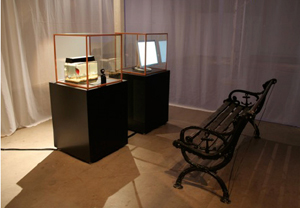
 |
Man Machine exhibition at
the National Museum of Science and Technology, Stockholm,
2006 |
|
Comparing the pieces made during the
Man Machine project to others made by Interactive Institute
many people have told me that they felt that the Man Machine
reached a much warmer approach and they felt they were far
more artistic. They were far more about art than engineering.
This is of course something you often here from people looking
at the media art from the outside: that it is "almost
art" and more about technology than artistic thoughts
and performing. Of course I totally disagree with this division
between fine art and media art since the media art of course
is a part of the fine art. Still I really understand what
they mean and I think this warmth is thanks to the artist’s
independence in the project, that s/he came up with the
ideas and that they, and only they, had the rights to the
concepts after the projects. |
This discussion of the roles and
how much of one piece the artist actually has to control her/himself
to maintain quality is large and important but I also think it
is very much due to individuals. I have worked with artists who
trust the engineers too much and their art becomes boring because
too much of the concept is in the hands of technicians and technology.
And I have met artists and engineers in whose collaboration the
artistic idea is not lost even though their art involves advanced
technology. In the same manner, I have also worked with artists
who have decided not to give anything away to the engineers but
to learn programming and engineering themselves and the result
has been that they have lost their artistic ideas and their art
has become too much about the technology. And I have worked with
artists taking care of the engineering and still maintaining,
and even gaining, artistic effort.
Parameters
In the beginning of this essay I
wrote that the frames I was given by the Interactive Institute
were very open. This meant that I had to identify the parameters
of the project and tune them in myself. In the evaluation of the
project I discussed with the participants what this meant and
what it would have meant to the project if we had changed this
tuning. Below I will discuss the parameters, how I tuned them
and what difference another tuning had meant.
i) Number
The number of artists and engineers would of course have an immediate
effect on the size and cost of the project, but there are some
other effects that are not that obvious. We looked for a discussion
on the topic man meets the machine and with a fewer number of
participants we would have risked a less vivid debate. With too
many involved we would have risked a situation where not everyone
in the project took part.
ii) Time
Time is an interesting parameter. Does more time necessarily bring
better ideas and better art? The best ideas in the Man Machine
project came up the first or the second day, and the rest of the
project, regarding time, was more or less production and a fight
against the clock. It is like the seminar situation, where you
often think that 20 minutes would have been enough for most speakers.
They wouldn’t have needed more time to give their core thoughts
and the rest of their notes seem to be more some sort of a decoration,
filling the time up.
iii) Theme
Another core parameter. Here you give the frames intellectually.
Man and machine is a very broad one. Here any idea dealing with
some sort of technology would have fit in. We could have chosen
a much tighter set up, deciding technology and deciding that the
project should deal with transformation of data from one media
to another. For example we could have chosen to work with surveillance
technology and a "Big Brother" theme.
Artists and engineers in
collaboration
How much should an engineer be
an artist and how much should an artist be engineer? This question
is discussed a lot within the media art field and as I see it
there is no simple answer. Looking at my own experience I have
met a number of artists really skilled in programming and engineering
and some of them has been making the most fragile things while
others have definitively been working more on the technique than
necessary healthy for them and their pieces have become a little
bit cold and lacked of artistic intelligence. It is hard to describe
the feeling:You see a perfect engineering work but it certainly
lacks something, hard to put your finger on what, it isn’t
just breathing. On the other hand I have been in so many situation,
so many projects, in which both the artist and the engineer have
been totally frustrated since they have felt that there is no
chance for them to understand each other, where the artist seems
to have an idea that is just not possible to match with a technical
solution and the engineer seems to have difficulties in describing
the problems. There are more explanations to theses situations
than just lack of communication. One is that the artists often
have had an idea which is more like a vision and to realize it
the engineer should have had to invent a number of new and probably
important patents. This is of course nice if you have the skill
and the money, but most projects are on a more basic level. Also
artists are used to work any time of a day, and when the engineers
might have day routines and also might be given just a few hours
for the project, this is a start for misunderstandings. When the
engineers start working it might take them a couple of days on
their own programming to solve problems and this time can be frustrating
for both parts.
It is interesting to compare these
experiences to Billy Klüver's when he was working with EAT.
For him it was important that both engineers and artists had the
deepest respect for the knowledge each of them carries and also
that they stick to what they are good at. Engineers should not
work as artists and the artists should not think they are engineers.
Still they should trust and respect each other as professionals.
In general I agree with that, but
again I would stress that it is up to individuals. Looking at
the Interactive Institute the engineers had earlier often taken
a quite large part in the creation and conceptual processes. I
am not so sure that was the wisest way to work, but one thing
struck me; those people really had started to think like artists
and they had started to understand the creativity process and
the value of the artists work in a way I hadn’t seen before.
And all artists also told me after the project that this time
was the first they had worked with people that really understood
what they were talking about.
The projects
We invited five artists, Johan Thurfjell,
Sachiko Hayashi, Drott Johan Löfgren, Tina Finnäs and
Christine Ödlund, and within the project each of them created
one new installation with the help from the engineers at Interactive
Institute. The result was then shown at the Man Machine exhibition
at the Museum of Science and Technology in Stockholm.
The theme suggested interactions
between man and machine, and this also became the main experience
of the exhibition, even if it was about other machines than you
normally find at the museum where the collections are mainly focused
on automobiles, steam engines and aircrafts. In the Man Machine
show the machines, computers, were hardly visible, which is also
significant for our society where we interact with different machines
every minute of our daily lives without even noticing. The machines
have become invisible, not only because they are made smaller
and smaller but also because we are so used to them we hardly
reflect over them. A general primal fright of technology might
slowly be exchanged to at least an acceptance.
The installations became very different
from each other which of course is due to the relatively open
theme but also due to the individuality of the artists. Drott Johan Löfgren’s piece Rumble Fish (Ink Abyss)
was the one that ended up most far from the central theme as it
was rather an interaction between a fish and the machine instead
of the man machine. He had a rumble fish in an aquarium and let
the motions of the fish trigger a digital drawing on a screen
placed next to the aquarium. Löfgren has for a long time
been genuinely interested in automatic drawings and worked out
a method where he documents "natural drawings" he finds
in nature or in the city and documents them with his camera. What
he is looking for is the "right rhythm of the line",
which he can find in the branches of a tree, in the waterline,
in dirt on a rock, in the foot prints birds leaves in the snow,
in slightly disappearing graffiti and so on. He uses the photo
documentation as a ground material and inspiration for a number
of colorful digital drawings and paintings where he borrowed the
aesthetics from old computers and used the windows paint as a
main tool.
When he in Rumble Fish (Ink Abyss)
chose to work with a fish and transferred the swimming to
a random drawing it was more or less just skipping one moment
in his normal moment – his own interpretation of the
nature. Of course Drott Johan Löfgren is not the first
one to work with "drawing machines". Already 1912
the French writer Raymond Roussel wrote the strange play
"Impressions d’Afrique" in which he described
a painting machine that would replace the artist. Roussel
was a part of the dada-movement and close to them were ideas
of randomness, automatic creations and a cult of the machine.
Jean Tinguely would later realize Roussel’s ideas
in his Metamatic series of painting and drawing machines.
Here, like in many other examples of painting machines,
for example the one of Rosemarie Trockel, lies a questioning
of authorship but also the surrealistic ideas of the automatic
drawing play a large role. For Löfgren this is of course
important, but his concern about the rhythm and the line
in the painting/drawings he finds or those made by the Rumble
Fish installation tells us that he is maybe even more interested
in the result, the actual drawing/painting. |
 |
Drott Johan Löfgren:
Rumble Fish (Ink Abyss) |
|
Technically the Rumble Fish
(Ink Abyss) was far from complicated. We had a simple web-camera
filming the aquarium and the tracking of the fish was made through
eyes-web and then there were some Java-programming for the transformation
to the drawing. A rumble fish was a good choice since the set
up required that there was only one fish in the aquarium and rumble
fishes are supposed to live alone, otherwise they will try to
kill each other. Also it collected oxygen from the surface which
meant we didn’t need any disturbing plants in the water,
just a heater and a oxygen pump that ran during the nighttime.
 |
Tina Finnäs: Estraden |
|
Also Tina Finnäs installation Estraden
had a quite basic technical solution. The idea was to create
a walk in which you triggered a spotlight wherever you went
along with a cut from Frank Sinatra’s New York New
York under the spotlight. Finnäs built 15 big flat
switchers of tin foil and foam plastic and covered them
with a large rubber carpet. When you walked on the switchers
you triggered the light and the music. It was possible to
play the whole song, but for that you had to find the certain
way to walk and you hade to find the exact tempo so each
part of the song would bridge over to another. The music
cuts and the spotlights was steered by a basic stamp programming.
The installation had something very rare
in the art since it communicated happiness. Hate, fear and
pain have through history been a larger inspiration to the
arts than anything else and pain and suffering is also deeply
connected to the cliché of the artist. Finnäs
hasn’t made it easy for her since happiness is some
sort of a key word in Finnäs works. She has shown a
great love to colorful and kitschy installations with a
lot of plastic and colored diodes and lamps that all together
create some sort of vision of what happiness looks like.
In Estraden the format was larger than in Finnäs earlier
work; gone were the colors since the floor was black and
the spotlights had no color filters. Sinatras singing rather
gave the installation a touch of glamour and the big stages
than the colored surface. You felt happy after a walk in
it and it was amazing to watch the audience trying to find
the right way to play the full song. |
Christine Ödlunds created a large
scale of a microscopic world, Fungus & Bacteria.
She had collected a number of hospital images of bacteria
and fungus and edited them in Director so that they seemed
to be moving, waving in the wind like a field with a very
strange flora. Looking after similar landscapes in the art
history one has to think of the jungles of Henri Rousseau
or what Max Ernst painted in the 1940’s. Using four
different projectors on four different and figure shaped
screens placed in front of each other, Ödlund manages
to create a strange mix between two and three dimensions
and this adds on the peculiar feeling you get when you entered
Fungus & Bacteria.
As a twist to the piece she added a suggestive
sound on a low volume and a small camera recording anyone
that stepped into the installation. Suddenly they would
find their own faces in one of the projections. This effect
was made using Max/MSP. |
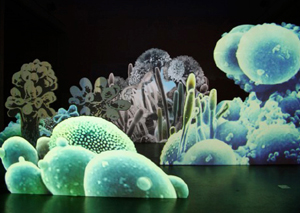 |
Christine Ödlund: Fungus
& Bacteria |
|
Sachiko Hayashi named her installation
Flurry. Here animated snow was projected on a huge screen.
Standing in front of it your shadow appeared on the screen and
when one of the flakes hit the shadow a sound was released. Hayashi
had recorded a number of interviews where different people told
memories of or reflections on snow. She had also asked a number
of sound artists to create a sound that illustrated snow. Acting
in front of the screen you could choose to let a single flake
melt on your shadow and concentrate on one sound, try to catch
them so that you created a certain rhythm and then make the piece
to your own or try to catch all flakes to release all sounds at
the same time creating a buzz.
 |
Sachiko Hayashi: Flurry |
|
Hayashi has worked in similar ways in
a number of web based pieces. Here you have used the mouse
and the marker to interact with the piece and to release
different effects to create narration. Many of them are
quite typical for the type of fine web art that has been
created when computers and band width have permitted larger
files and more pictures. In many ways Flurry is a translation
from the web based pieces to the physical room where you
use your own body as a mouse and your shadow as a marker.
The web based art has a special context, a special room;
this in combination with the computer screen and the surrounding
context might differ from an office space or your own home
which create an intimacy. That of course is gone with the
large projection and the step into the gallery room. This
is made in a different scale and this changes the way the
piece is perceived and understood radically. Everything
you did with your hands you now do with your whole body.
The sound that was very much related to the computer speakers
(if you are not connecting your computer to a hi-fi equipment)
is here in the whole room. And the biggest change is of
course the space, you perceive and experience the piece
in a physical space. Instead of letting only a part of your
body interact on a two dimensional level you here acted
with your whole body in a three dimensional space. |
The different stories about snow
together with the fragile sounds the different sound artists had
composed gave the piece a very poetical touch. Since the installation
had a very tempting interactive aspect this was probably a great
part of the success of the piece. Inviting the audience to interact
with the piece, especially in large installations where you use
your whole body, also invite people to make moves that they normally
won’t do in a gallery space. They will jump up and down,
wave with their arms, try to trigger everything possible at the
same time, running around etc. The poetry and the fragility of
Flurry however asked people to investigate the piece slowly and
carefully and this with a great benefit to the art.
The fifth piece was The
Dream by Johan Thurfjell. This piece continued themes
and methods Thurfjell has been working with in a number
of pieces before. He has for a long time tried to write
down as much as he can of his dreams. If you try this yourself,
you will discover how difficult it is. When you wake up
you feel quite sure what it was all about, the dream has
been your reality for let’s say the last twenty minutes
and you should be able to describe it in detail. But when
you start, everything cracks up and disappears. Thurfjell
has used this in some pieces but here he for the first time
had a chance to complete the idea. He built a corridor and
at the end of it he placed a plasma screen. On the screen
was a text, one of Thurfjell’s dreams, written with
very tiny letters. To read it you start to walk towards
it, but at the same time you start to walk nearer, the text
starts to dissolve and when you are close enough to distinguish
the letters, they have disappeared totally.
|
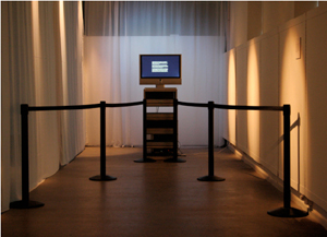 |
Johan Thurfjell:The Dream |
|
Thurfjell illustrates the functions
of the dreams but also plays with the idea of interactive art
since this is a rather dysfunctional interaction. Instead of creating
something, you destroy it. The idea reminds me of Julian Bleecker
and Marina Zurkows Pussy Weevil where an animated little figure
was calling on your attention in the most obscene ways. But when
you approached him and came closer to the monitor he got scared
and got off. The technical solution, and the concept, of The Dream
installation were much more elegant. Technically we used ultrasonic
sensors to measure the distance to the spectator and then just
some simple basic stamp programming to steer an animation made
in Director. This gave a very smooth disappearance of the text.
Communication as gravity
I will hear try to summarize some
of the experiences of the Man Machine project. First of all it
was a practical experiment where we played with the parameters
of an art production and tried to see if the process could indicate
what the parameters meant. Also it was an experiment to see how
the engineers at the Interactive Institute would work together
with external artists. We looked carefully of different models,
mainly those developed by Billy Klüver and E.A.T. (if that
could be described as models) and at several artist-in-residence
programs.
The project was also an investigation
of man’s interactions with machines, a core topic for the
research within the Interactive Institute. I have always had problems
with the "interactive art" since all kind of art interacts
in some way. Even painting is interactive, since my interpretation
seems to interact with the surroundings of the piece and the context
it is put into. If we look at what we in general think of as "interactive
art" I still always have some doubts. For example, if I interact
with an interactive video installation, does it really change?
I mean it is not with a very few and rare exceptions, it is just
showing what it is programmed, predestined, to do. I find this
limiting. I would like the piece to interact back, start to really
act on it’s own, taking to whole room, the universe and
the full context into it’s calculations. Still I have to
admit something happens when you step into Sachiko Hayashi’s
Flurry or Johan Thurfjell’s The Dream. Something hard to
put your finger on, but your own actions and movements really
strengthen the experience of the piece. In short I would explain
this phenomenon as a combination between intellectual and physic
activity which multiplies your experience. On top of that a complex
interaction feeds back to interpretation from interaction system
which creates a chain reaction of intellectual interpretations.
During the work with this exhibition
and a couple of other projects I was producing at the same time,
it struck me how intense the communication is when we involve
technology, especially mobile technology. We are interacting with
each other, with communities, with technology all the time and
we hardly reflect on it since most of the interaction is hidden
and the result of it invisible. And we are communicating on so
many dimensions, locally, global and virtually, at the same time.
We are in a way lost, floating in between the dimensions where
physical gravity is not enough and we have invented some new form
of it – a gravity of communication. Maybe it is that kind
of gravity that becomes visible and strikes you when entering
an art exhibition like the Man Machine.
|
